BRANDING
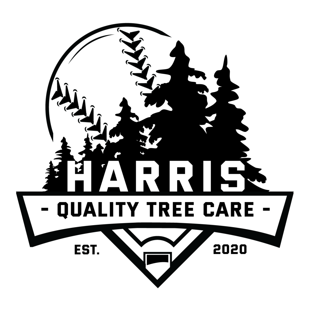
Harris Quality Tree Care: Logo & Tee Shirt Design (2020)
A logo was needed for a small, local tree service, Harris Quality Tree Care. Priorities were simplicity and to incorporate trees.
Using negative space, “Harris” was placed within a background of trees, not only clearly identifying the owner and name of the company, but also suggesting that he can be found in the trees and feels comfortable there.
This logo was used for printed materials such as business cards and letterhead, as well as truck decals, screen printing, and on their Facebook page.

improvements by stowell(2021)
Update the logo for a small, local, full service home repair, maintenance, and installation company. Priorities communicated by the client were simple, bold, timeless, easy to read, and versatile enough to be used for digital, print, and other applications.
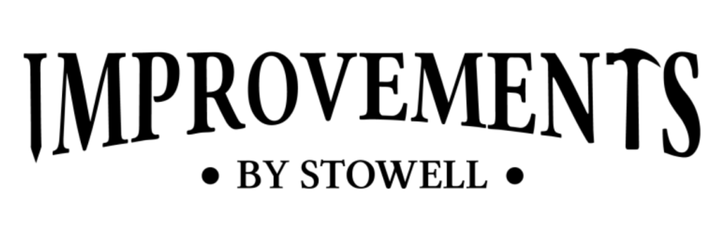
Using past logo concepts as reference, I modernized and streamlined the logo. The simple typeface allowed for subtle inclusion of repair tools in the logo without compromising its integrity, helping to communicate that the referred to “improvements” were construction-related.

Leave a comment